Link Test: https://svra.com/gtb/?lib=report&action=jlr_redirect
Version 1

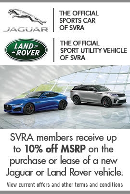
Version 2 – Edits: Could you center the logos? I understand the CTA text may need to be smaller but the logos should be centered for CI purposes. The Jaguar Logo should be the chrome (the one that is on the page currently) because it is in close proximity to the LR logo so no need to change the Jag leaper to the flat solid version.

Version 3 – Edits: The image background is pretty tough to over come for the logo to be clear. I have one more thought here. Would your Graphics person be able to draw up the attached? I used part of the existing graphic… with the Logo and SVRA sponsor lock up. This way the logos are on a solid background and we are able to get the additional messaging about Jaguar and Land Rover being the official vehicles of SVRA.

Version 4 – Edits: Can you put the shorter CTA text on it? “SVRA members receive up to 10% off MSRP on the purchase or lease of a new Jaguar or Land Rover vehicle” on the option 3 imagery?

Left column ad graphic